ShopDreamUp AI ArtDreamUp
Deviation Actions


![[V] Kirin #1](https://images-wixmp-ed30a86b8c4ca887773594c2.wixmp.com/f/85dc65f8-3255-4a14-82fe-0d354c24ea83/dclrj2e-3ba1f1f5-a09b-419b-a61c-56b216d21e64.png/v1/crop/w_184,h_184,x_0,y_1,scl_0.015553677092139/_v__kirin__1_by_cirillaq_dclrj2e-92s-2x.png?token=eyJ0eXAiOiJKV1QiLCJhbGciOiJIUzI1NiJ9.eyJzdWIiOiJ1cm46YXBwOjdlMGQxODg5ODIyNjQzNzNhNWYwZDQxNWVhMGQyNmUwIiwiaXNzIjoidXJuOmFwcDo3ZTBkMTg4OTgyMjY0MzczYTVmMGQ0MTVlYTBkMjZlMCIsIm9iaiI6W1t7ImhlaWdodCI6Ijw9MTk2OCIsInBhdGgiOiJcL2ZcLzg1ZGM2NWY4LTMyNTUtNGExNC04MmZlLTBkMzU0YzI0ZWE4M1wvZGNscmoyZS0zYmExZjFmNS1hMDliLTQxOWItYTYxYy01NmIyMTZkMjFlNjQucG5nIiwid2lkdGgiOiI8PTE5MjAifV1dLCJhdWQiOlsidXJuOnNlcnZpY2U6aW1hZ2Uub3BlcmF0aW9ucyJdfQ.RSfVEKUJhrZTXNL0b7aisizVVDSFuBWn61_scKg_zWk)
![[V] Kirin #1](https://images-wixmp-ed30a86b8c4ca887773594c2.wixmp.com/f/85dc65f8-3255-4a14-82fe-0d354c24ea83/dclrj2e-3ba1f1f5-a09b-419b-a61c-56b216d21e64.png/v1/crop/w_92,h_92,x_0,y_1,scl_0.01/_v__kirin__1_by_cirillaq_dclrj2e-92s.png?token=eyJ0eXAiOiJKV1QiLCJhbGciOiJIUzI1NiJ9.eyJzdWIiOiJ1cm46YXBwOjdlMGQxODg5ODIyNjQzNzNhNWYwZDQxNWVhMGQyNmUwIiwiaXNzIjoidXJuOmFwcDo3ZTBkMTg4OTgyMjY0MzczYTVmMGQ0MTVlYTBkMjZlMCIsIm9iaiI6W1t7ImhlaWdodCI6Ijw9MTk2OCIsInBhdGgiOiJcL2ZcLzg1ZGM2NWY4LTMyNTUtNGExNC04MmZlLTBkMzU0YzI0ZWE4M1wvZGNscmoyZS0zYmExZjFmNS1hMDliLTQxOWItYTYxYy01NmIyMTZkMjFlNjQucG5nIiwid2lkdGgiOiI8PTE5MjAifV1dLCJhdWQiOlsidXJuOnNlcnZpY2U6aW1hZ2Uub3BlcmF0aW9ucyJdfQ.RSfVEKUJhrZTXNL0b7aisizVVDSFuBWn61_scKg_zWk)


Description
Inspired by: 
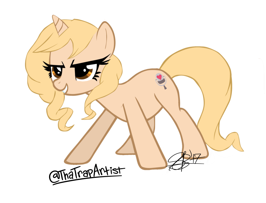
Tara Strong Ponified #2
IF YOU ARE PLANNING ON USING THIS IN ANY WAY:
I HAD SOMEONE UPLOAD MY WORK WITHOUT PERMISSION, AND THIS USER ALSO DELETED MY SIG, UPLOADED IT, AND GAVE NO CREDIT! DO NOT REPEAT THIS STUPID ACT, OR YOU'LL BE REPORTED.
Instruction on using it:
YOU MAY:
-Edit
-Post
-Share it
-do anything with it
-delete my sig
HOWEVER GIVE CREDIT AND ASK FOR PERMISSION!
Image size
900x688px 154.41 KB
© 2012 - 2024 xxXSketchBookXxx
Comments41
Join the community to add your comment. Already a deviant? Log In
Before I get to the good, I've got three gripes. First, probably a simple mistake: on her cutie mark, the white space between the mic and its stand should match the color of her coat. Second, her belly seems to be hanging oddly low. Third, and most importantly: your outlines are messy. They need to be of a consistent width. Many art styles, such as this one, allow for more freedom to play with outline width, but even then, there has to be a rhyme and reason to it; it has to fit the art style in order to look right. In this case, you have a canon-style MLP pony - composed entirely of simple, clean shapes and a small number of flat colors. This contrasts sharply with the varying outline widths, which look haphazard and random, as if you hadn't considered them at all - which, in all honesty, I'm guessing you probably didn't. I'm also guessing you're pretty new to vectoring, in which case that's understandable. So I ask you this: what were your methods? What program and tools did you use to outline her? If you'd like, I can help you and direct you to tutorials depending on your answer.
Now, the good stuff. I love the character design. It's adorable, it does a pretty great job of capturing Tara's personality, and perhaps most importantly, it doesn't hurt my eyes. Many people creating original characters make similar mistakes: using too many colors; using colors that clash or are over-saturated; adding body parts nobody expects ponies to have, like antlers; and making their character excessively OP, especially by making them alicorns. You've avoided all the rookie design mistakes, chosen a tasteful, pleasing color palette, picked a confident pose fit for Ms. Trollicious, and come up with quite possibly one of the most adorable hairstyles I've ever seen. It's amazing! It's awesome! It's incredible! Just gotta fix them minor mistakes and that outline width so its magnificence isn't marred.